Advertisement
Data doesn’t always speak clearly. To make it understandable, you need visuals. Scatter plots are simple, but powerful when done right. If you’re working with numeric data and want to show trends, clusters, or outliers, a scatter plot is one of the best tools you can use. In Python, matplotlib gives you everything you need to create clear, readable plots.
But there’s more than one way to use it. This article walks through seven useful methods for scatter plot visualization in Python using matplotlib, showing how small tweaks can make your charts much more readable and meaningful.
The first step in scatter plot visualization in Python using matplotlib is the most direct one. The plt.scatter() function from matplotlib.pyplot lets you plot two lists or arrays as X and Y coordinates. Each pair of points becomes a dot on the chart. It looks clean and is easy to read for small to medium datasets.
You only need to import matplotlib.pyplot, prepare your two variables (like x = [1,2,3] and y = [4,5,6]), and then call plt.scatter(x, y). Add plt.show() to display the plot. This is the most basic setup, but it builds the foundation for more advanced customization.
Once you’ve got a working scatter plot, the next thing to explore is coloring. Color makes a chart easier to interpret when you're comparing categories or highlighting intensity. The c parameter inside plt.scatter() lets you apply different colors to points, either manually or based on values.

For example, say you have a third variable that you want to use to differentiate the dots. You can pass a list of numbers or labels to c, and matplotlib will map those to colors. If the values are continuous, you can even use a color map (cmap) like 'viridis' or 'plasma'. Just remember to add plt.colorbar() if you want users to know what the colors mean.
This technique helps with visualizing another dimension without cluttering your scatter plot with too much text or additional shapes.
A matplotlib scatter plot can also encode meaning through the size of the points. The s parameter is used for this. Larger values create bigger circles, and this is often useful for showing things like population size, risk level, or revenue across different data points.
You might plot sales on the x-axis and profit on the y-axis, but use s to represent the number of stores per region. Sizes can be adjusted using basic multiplication to scale them properly. Just like with colors, using sizes lets you show three dimensions of data in two.
This isn’t just decoration—it makes it possible to spot anomalies where values don't scale the way you expect.
One issue you’ll run into quickly when plotting categories is that users won’t know what each color or group means unless you add a legend. For that, you’ll need to create grouped scatter plots manually using a loop.
You can iterate through your unique categories and plot each group separately with a different color and a label. Then, call plt.legend() to display the group names. This method gives you full control over how each group looks. It’s especially useful when you want to distinguish between different groups or classes of data and avoid confusion.
This approach gives more clarity than trying to pack everything into one function call with category lists.
Sometimes a point on the chart stands out and needs extra explanation. That’s where annotations come in. You can use plt.annotate() to label individual points directly. This is helpful when you want to draw attention to an outlier or highlight a specific point without adding noise to the whole plot.
The function allows you to set the location of the text, customize the font, and even draw arrows pointing to the dot. It’s a small feature, but when used well, it keeps the plot clean while still being informative.
This technique is especially helpful in presentations or dashboards where some insights need to stand out.
Large datasets can make scatter plots unreadable. If many points overlap, the plot turns into a messy blob. The alpha parameter in plt.scatter() controls transparency. Setting alpha=0.5 makes each dot semi-transparent, which helps you see where points are stacking up.
This doesn’t change the data, but it reveals density patterns. High-density areas look darker, while low-density areas remain light. It’s a quick way to improve visual clarity without needing advanced statistical methods.
Especially in exploratory data analysis, this is a quick fix to understand if your data clusters or not.
For one more level of complexity, you can step into 3D. matplotlib includes a toolkit called mpl_toolkits.mplot3d that lets you create 3D scatter plots. You’ll need to import Axes3D and define a 3D axis using fig.add_subplot(111, projection='3d').
You can then call ax.scatter(x, y, z) to plot three-dimensional data. These plots help when you need to visualize relationships among three numeric variables. However, be careful with perspective—it can sometimes hide details depending on the angle.
Use ax.view_init() to adjust the camera angle if necessary. 3D scatter plots are great for demonstrating patterns that aren’t easy to detect in 2D.
Working with data is about more than just numbers—it’s about making patterns clear. A scatter plot can handle this well, especially when you go beyond the basics. Color, size, labels, and grouping can each highlight different parts of your data. Adding transparency or moving into 3D helps when things get crowded or you need to show more than two variables. With scatter plot visualization in Python using matplotlib, you can turn raw values into something readable and useful. The goal is simple: make your data easier to read, faster to understand, and harder to misinterpret.
Advertisement

Learn about Inception Score (IS): how it evaluates GANs and generative AI quality via image diversity, clarity, and more.
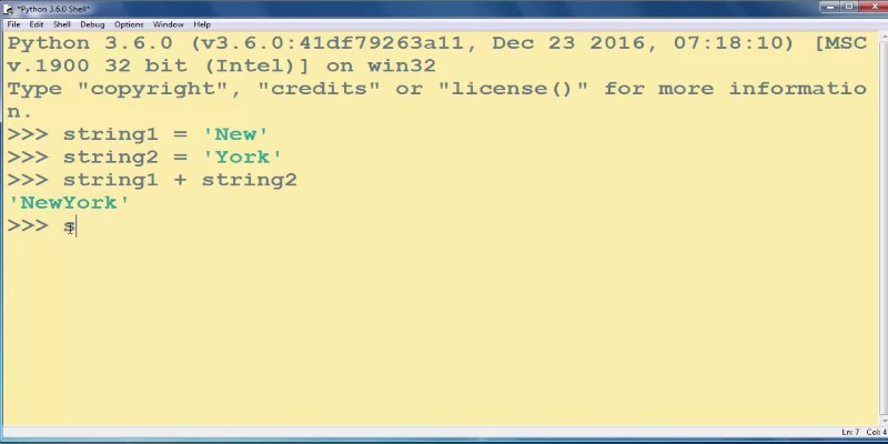
How to add strings in Python using 8 clear methods like +, join(), and f-strings. This guide covers everything from simple concatenation to building large text efficiently

Compliance analytics ensures secure data storage, meets PII standards, reduces risks, and builds customer trust and confidence

Want to build a dataset tailored to your project? Learn six ways to create your own dataset in Python—from scraping websites to labeling images manually

SAS acquires a synthetic data generator to boost AI development, improving privacy, performance, and innovation across industries

Discover multilingual LLMs: how they handle 100+ languages, code-switching and 10 other things you need to know.

Ask QX by QX Lab AI is a multilingual GenAI platform designed to support over 100 languages, offering accessible AI tools for users around the world

Learn how to convert strings to JSON objects using tools like JSON.parse(), json.loads(), JsonConvert, and more across 11 popular programming languages

Learn 8 effective methods to add new keys to a dictionary in Python, from square brackets and update() to setdefault(), loops, and defaultdict

Looking to turn your images into stickers? See how Replicate's AI tools make background removal and editing simple for clean, custom results

Create user personas for ChatGPT to improve AI responses, boost engagement, and tailor content to your audience.

Learn seven methods to convert a string to an integer in Python using int(), float(), json, eval, and batch processing tools like map() and list comprehension